
Finish Lines is a community-led run club and book club built around the idea that progress looks different for everyone. By bringing together movement and literature, the concept encourages people to challenge themselves physically and creatively while finding connection through shared experiences.
Rather than positioning success around pace or performance, the brand celebrates every finish line, whether that's completing a 10K, finishing a novel, or simply showing up.
THE CHALLENGE: Create an identity that brings running and reading together in a way that feels cohesive, distinctive and welcoming — while building a digital experience that could grow with the community.
Finish lines was developed as a scalable run and book club, combining community, movement and reading under one distinctive identity.
The strategy focused on creating a brand people would want to belong to, while building the foundations for future growth across multiple cities.
Define a warm, professional and witty brand personality
Create a membership model built around community and recurring participation
Develop milestone merchandise and events to reward engagement
Build a scalable structure for future city-based communities
Create a flexible digital system including a website that could grow with the brand

Curious. Consistent. Not particularly competitive.
Someone who enjoys the feeling of finishing something - whether that's a 10K, the last chapter of a book, or simply making it to this week's meetup. They're looking for community, accountability and a reason to keep showing up.
The visual language balances athletic energy with editorial sophistication. A warm, confident palette sits alongside classic serif typography and clean sans-serif type, while bold graphic patterns inspired by finish tape create a distinctive identity that feels equally at home on a bookshelf or a starting line.
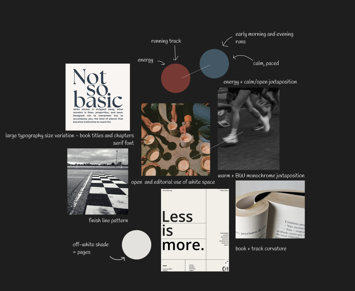

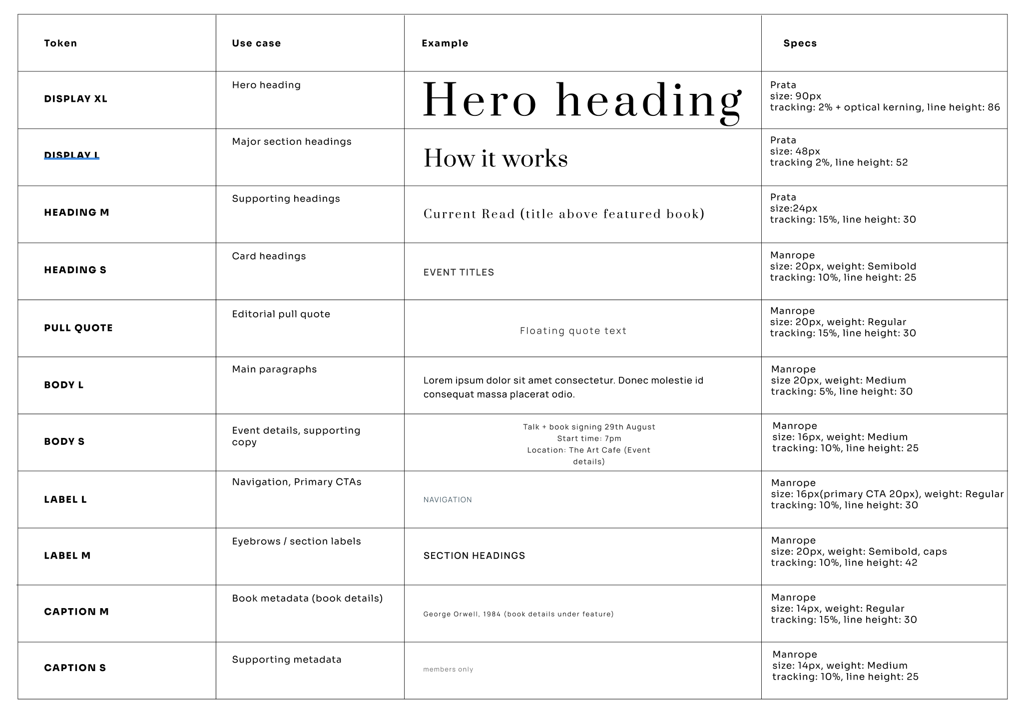
The visual language balances athletic energy with editorial sophistication. A warm, confident colour palette sits alongside classic serif typography and clean sans-serif type, while bold graphic patterns inspired by finish tape create a distinctive identity that feels equally at home on a bookshelf or a starting line.
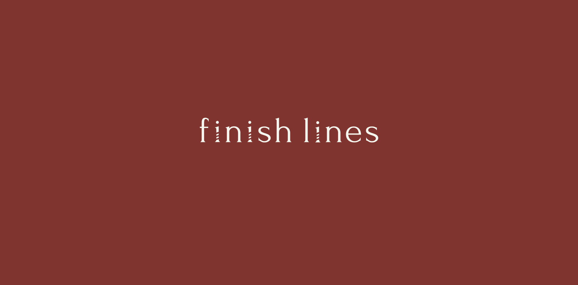
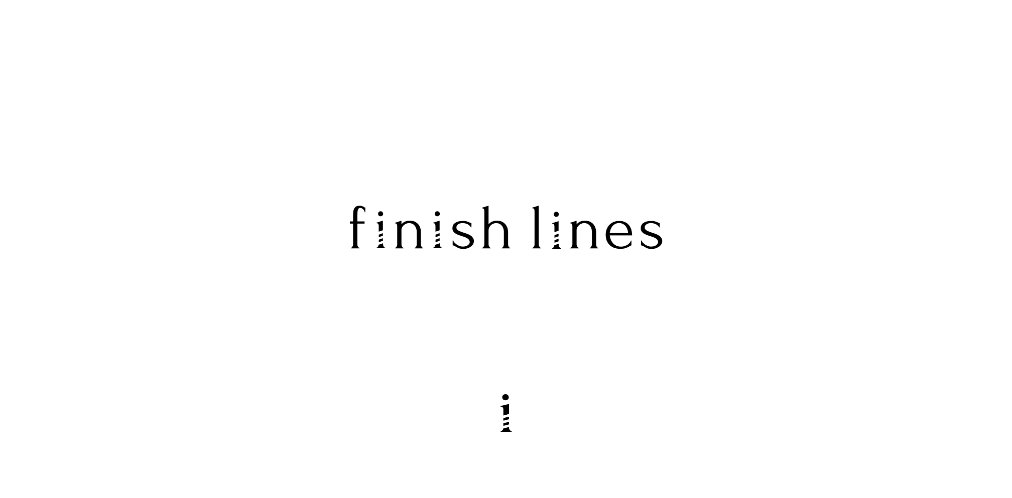
The adapted ‘i’ monogram combines a fragmented finish-line motif with the Roman numeral I, representing both the act of crossing a finish line and the beginning of a first chapter.
The Finish Lines identity was designed to feel just as at home in the real world as it does online. Bold graphic elements, considered typography and a flexible colour system carry across merchandise and community touchpoints, creating a recognisable brand wherever members encounter it.
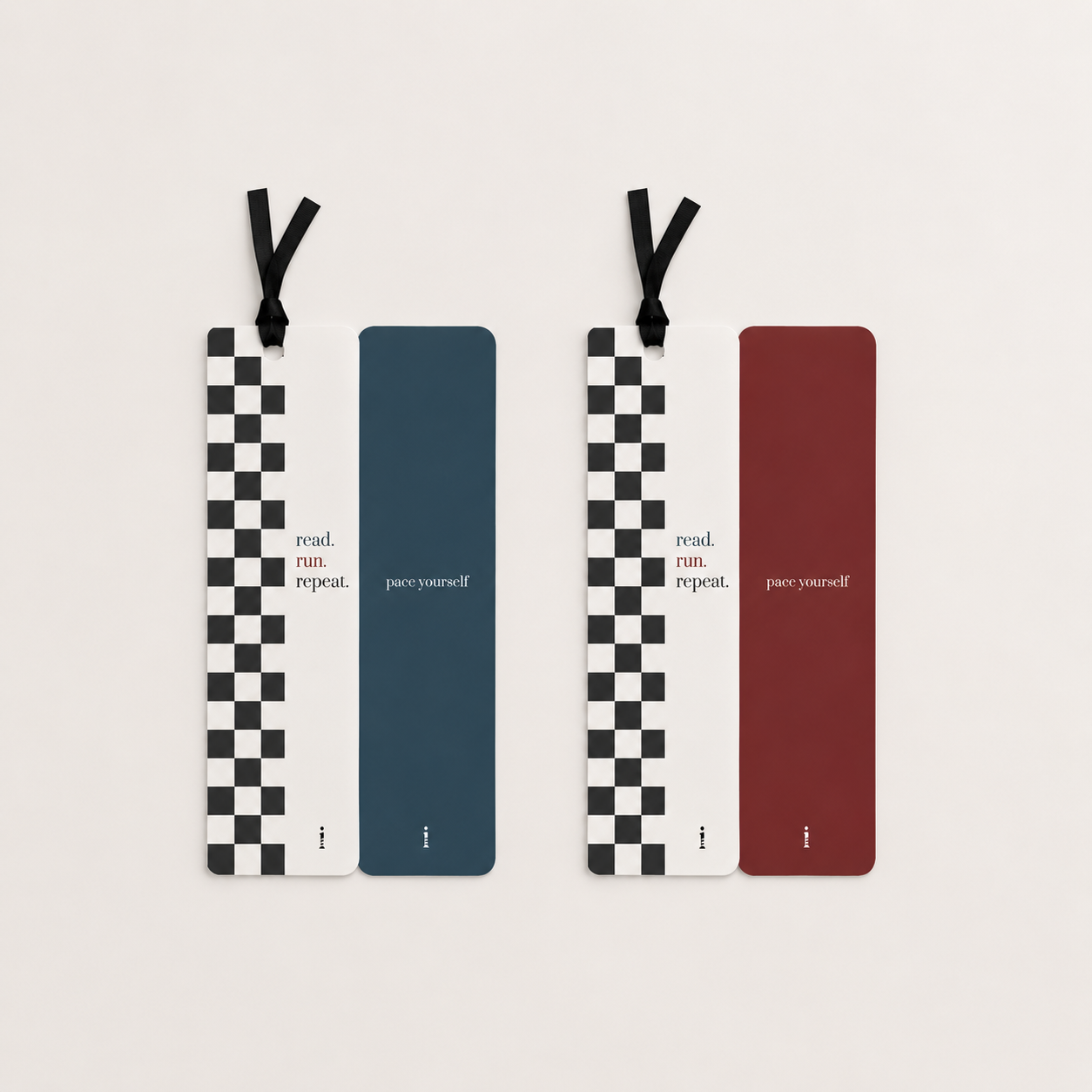
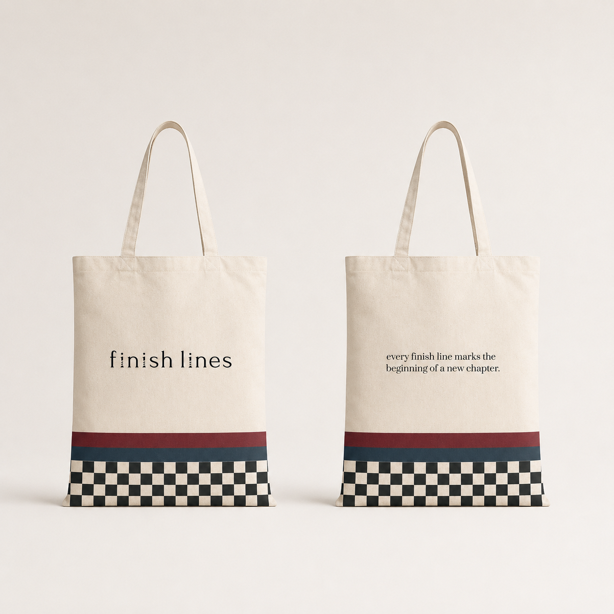
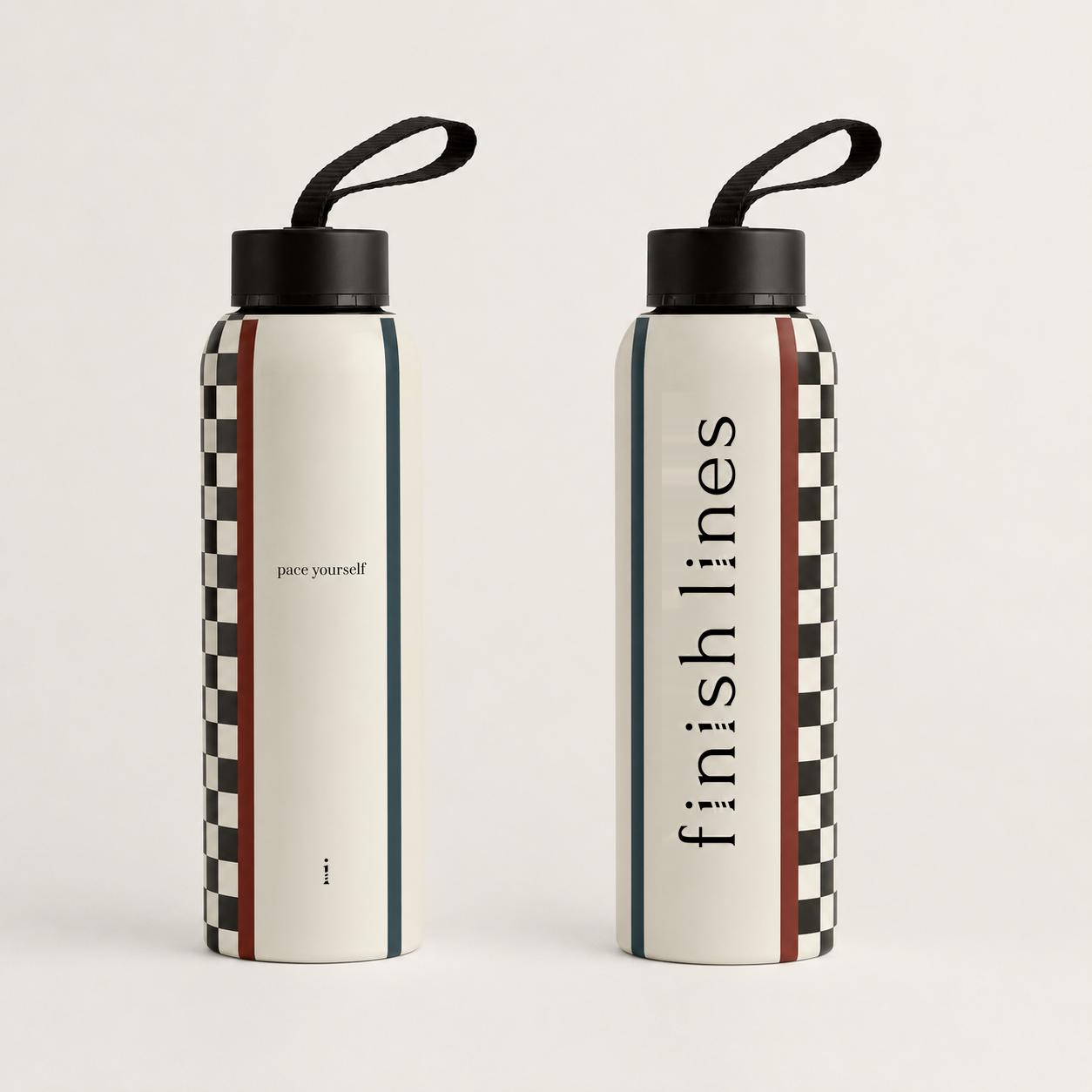
The homepage establishes the Finish Lines identity from the outset, clearly communicating its run club and book club concept through editorial typography, bold colour and a flexible visual language.
Runs, book discussions and community meet-ups are presented as clear, approachable event cards, making it easy to see what's happening, when it's happening and how to get involved. The flexible structure also allows the calendar to grow as the community does.
Participation is rewarded through a series of milestones, giving members small moments of recognition as they keep showing up. The system turns consistency into something tangible, encouraging engagement without making the experience feel competitive.
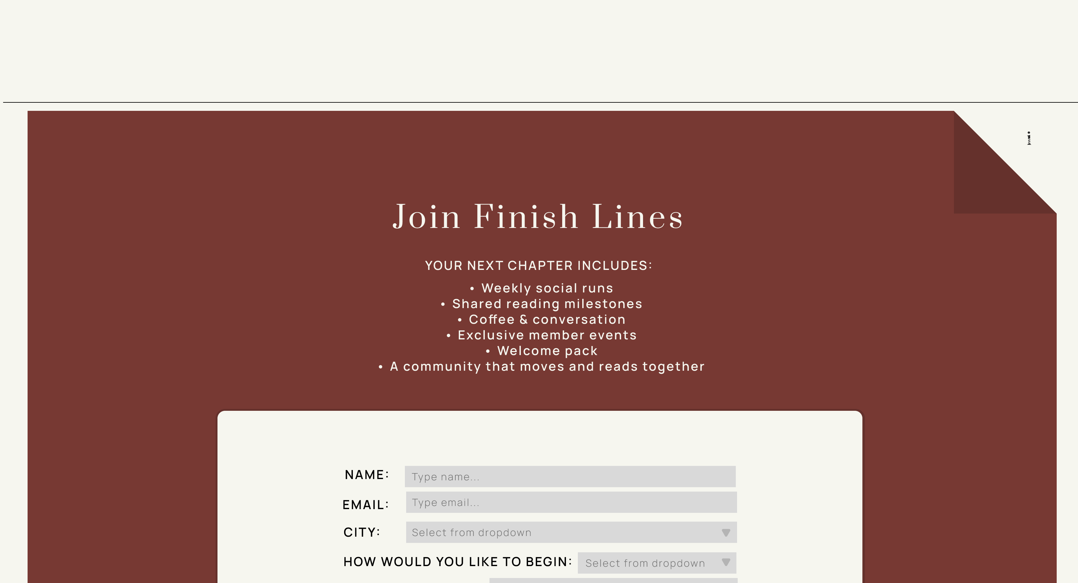
The membership journey was designed to keep sign-up straightforward while capturing the information needed to create a more connected community. The form sits naturally within the wider experience rather than interrupting it, making the transition from browsing to belonging feel effortless.
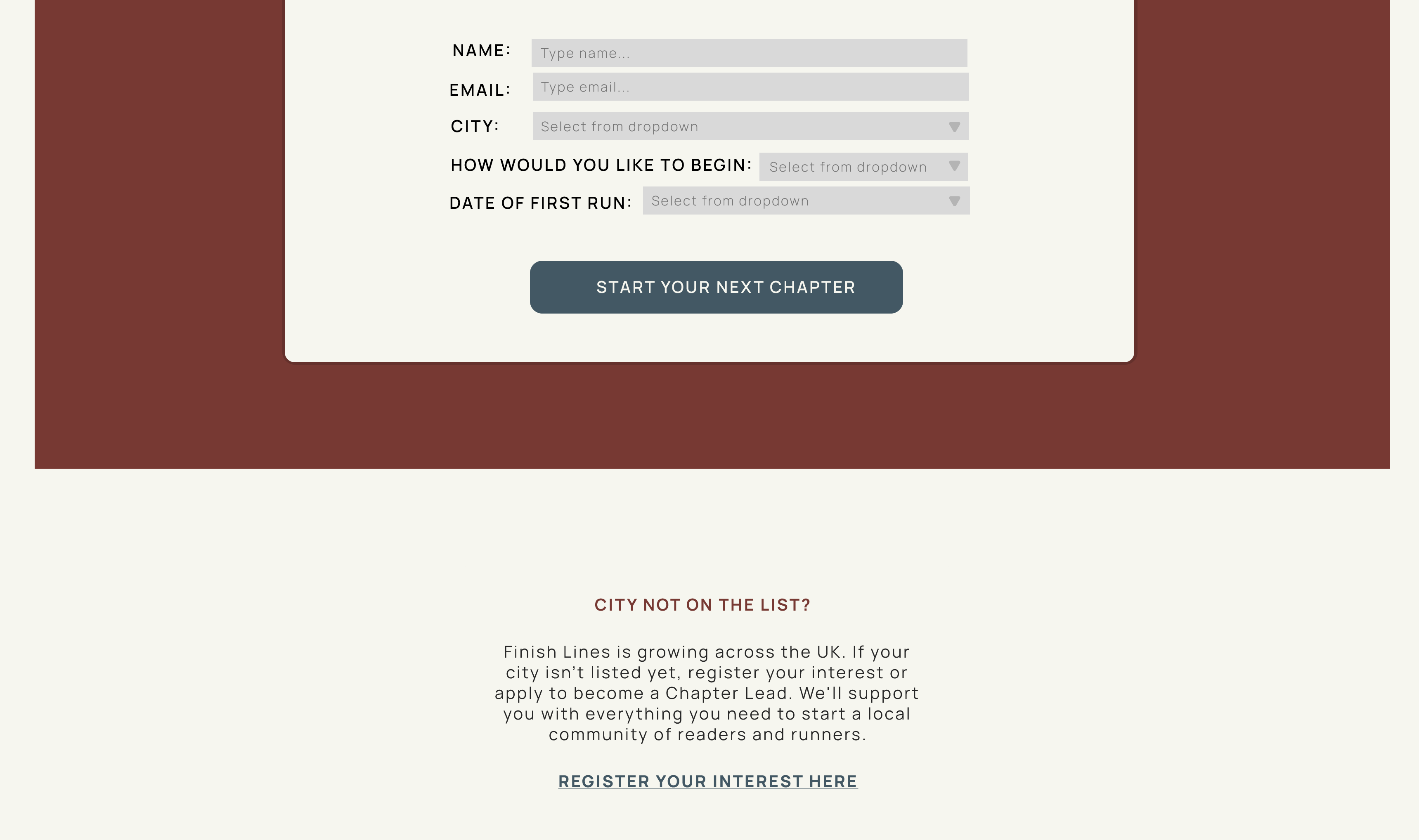
Finish Lines isn't tied to a single location. The invitation to start a group in a new city is built directly into the experience, creating a simple pathway for members to take ownership and grow the community.
Finish Lines explores how branding can bring seemingly different communities together around a shared idea. By connecting movement with literature, the concept creates a space where progress isn't measured solely by pace or performance, but by participation, curiosity and connection.
The project challenged me to create an identity with enough energy to belong to running culture while retaining the restraint and thoughtfulness of editorial design.
The resulting system was designed to grow with the community, with the website's UX structured to accommodate an expanding calendar of runs, book selections, community content and future features. This created a flexible foundation that could evolve without compromising the simplicity of the experience.
Whether you're creating a brand from scratch or need to refine an existing identity I'd love to hear about your project.

© 2026 Neuron Coded. All rights reserved.