
The Hip Circle began as an idea for a series of belly-dancing classes. But the founder wanted the concept to become something more meaningful than simply another dance or fitness class. After running several sessions, she noticed a recurring response from participants: women weren't just enjoying the dancing, they were leaving feeling better about themselves. That became the starting point for the brand.
I worked with the founder to uncover what was really valuable about the experience and translate it into a clearer proposition: a welcoming space where women could reconnect with themselves, build confidence through movement and connect with one another.
THE CHALLENGE: How can we position belly dancing as an experience centred around connection, confidence and community, rather than fitness?
The strategy focused on moving the brand away from conventional fitness culture and towards something warmer and more inclusive, with an identity that could communicate joy, energy, sensuality and belonging.
Define a clear community-led positioning beyond traditional fitness and dance classes
Create a brand that feels welcoming, expressive and confidence-building
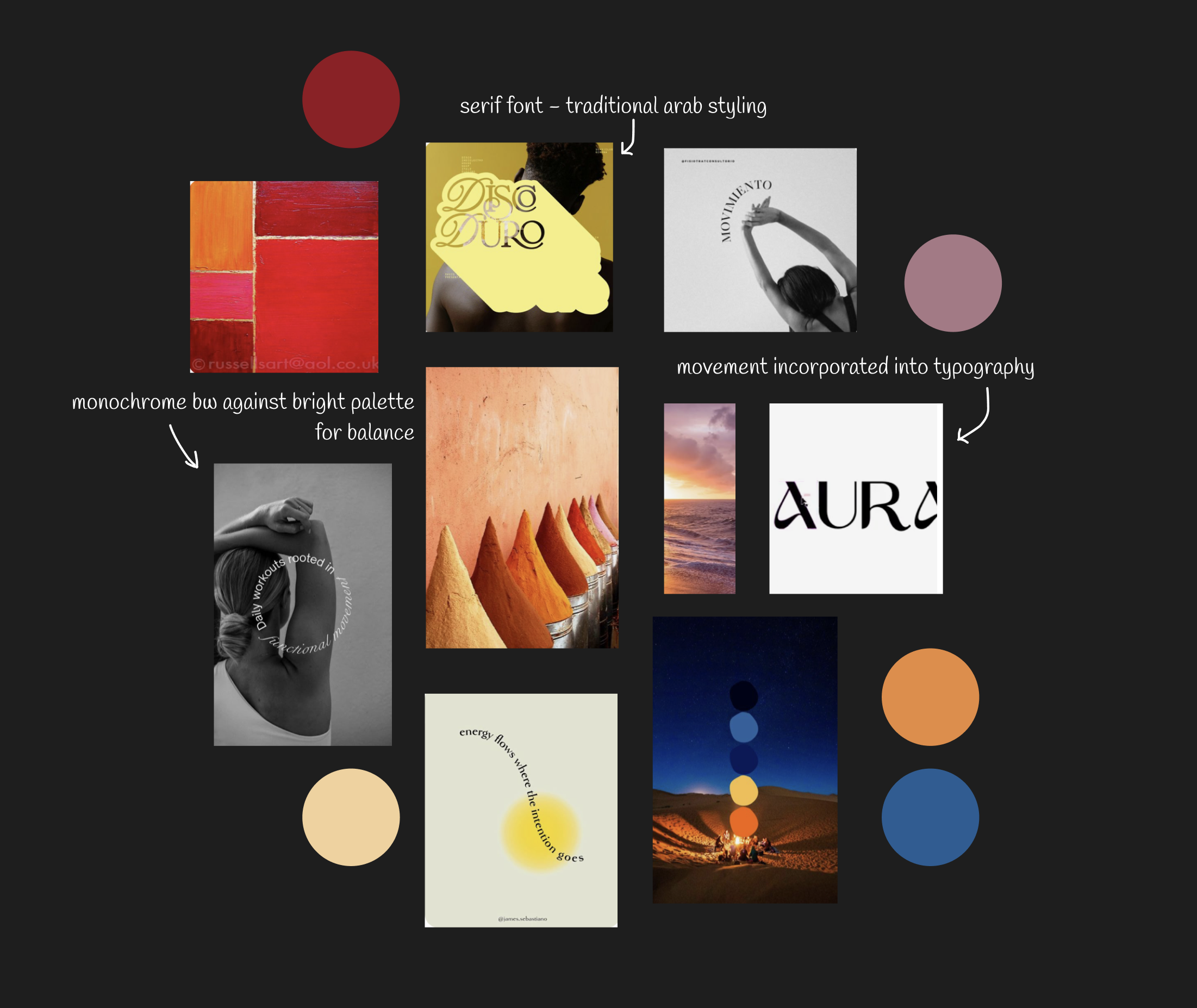
Develop a visual language inspired by sun, desert landscapes and natural warmth
Use movement within the typography to make the identity feel fluid and alive
Build a flexible identity system for social, events, classes and physical applications
The visual language draws from the warmth and sensuality of sunset and desert landscapes, balancing rich earthy tones with cooler blues and lilacs. The result is expressive and energetic without feeling overwhelming, creating a sense of warmth, confidence and calm.

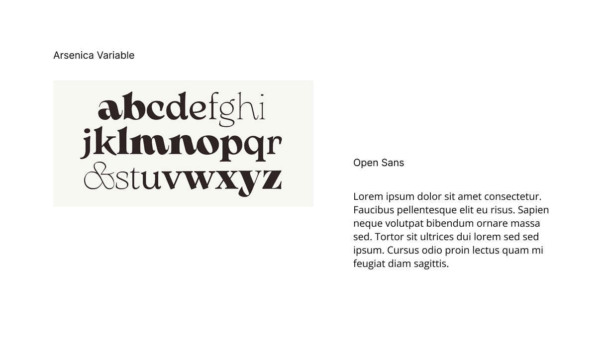
Typography balances traditional elegance with contemporary simplicity. Arsenica Variable provides the expressive character of the identity, while Open Sans introduces clarity and accessibility across supporting content. The contrast allows the brand to feel distinctive without compromising usability.
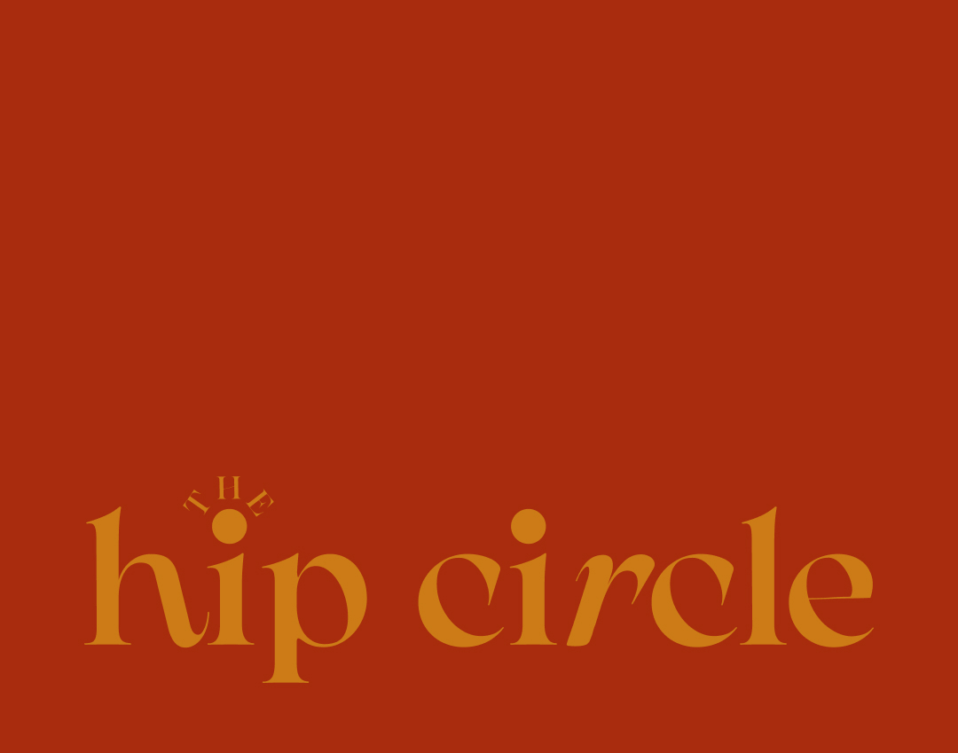
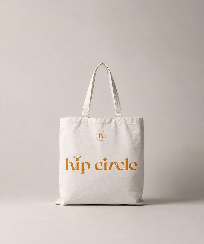
The identity was designed to make belonging feel tangible, translating the visual language into physical touchpoints that reinforce the sense of community at the heart of Hip Circle.
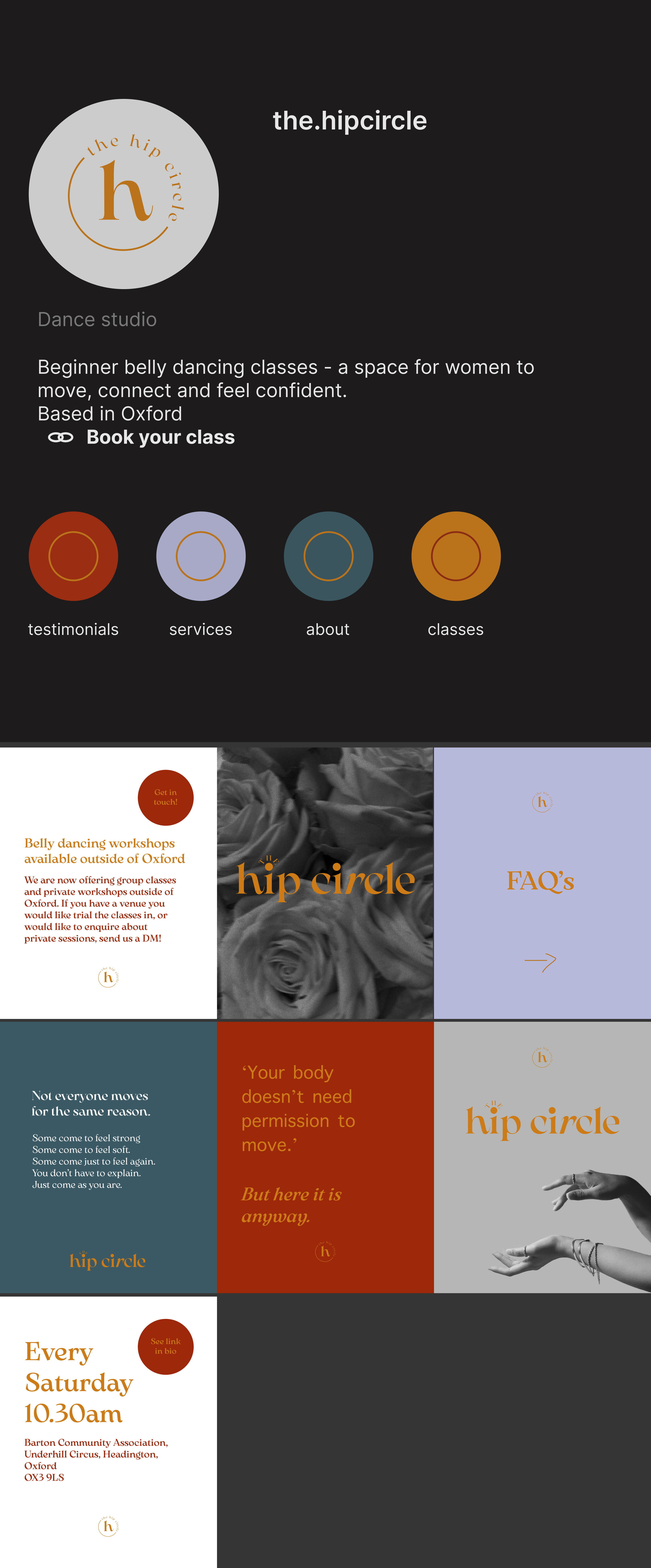
The visual identity was designed to translate seamlessly across social, giving Hip Circle a recognisable and cohesive presence while keeping the content feeling energetic, welcoming and distinctly its own.
The Hip Circle evolved from an idea for belly-dancing classes into a clearer brand built around movement, confidence and connection. The identity gives the concept a distinct personality and creates a flexible foundation for classes, social content, events and future growth.
The biggest challenge was capturing the energy and sensuality of belly dancing without falling into the visual language of traditional fitness branding. This required balancing expressive typography and warm, energetic colour with softer tones and a sense of calm, creating an identity that feels confident and joyful without becoming overwhelming.
Whether you're launching something new or want to refine your branding, I'd love to hear about your project.

© 2026 Neuron Coded. All rights reserved.